



The Pareto Principle applied to UX design reveals that 20% of your digital experience flows drive 80% of user drop offs. Here is where to focus first.
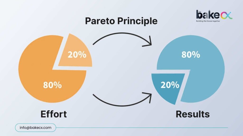
The Pareto Principle, also known as the 80/20 Rule, isn’t a formal step of Design Thinking. But at BakeCX, we’ve embedded it as a strategic lens within our Design Thinking practice. Why? Because focusing on the wrong areas drains time, budget, and adoption potential. Focusing on the critical 20% multiplies impact that why the 80/20 Rule matters in UX
The Pareto Principle isn’t just a theory — it’s reality in digital experiences:
- 20% of UX flaws cause 80% of user drop-offs
- 20% of focus areas drive 80% of support tickets.
- 20% of missed expectations can trigger 80% of churn
Design Thinking aligns perfectly with this approach: it’s about identifying which 20% truly drives impact, and then channeling resources there.
The Cost of Ignoring it
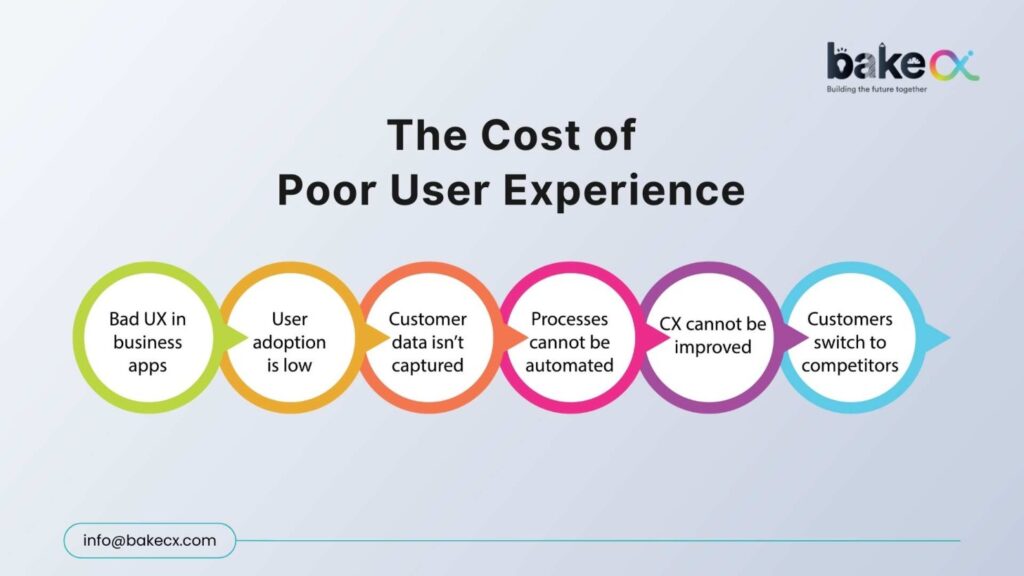
Neglecting the critical 20% doesn’t just harm experience — it drains growth:
- Higher acquisition spend: Users leave if key UX issues aren’t fixed, forcing you to spend more to replace them.
- Slower adoption: Confusing flows make users hesitant, slowing product growth.
- Brand erosion: One bad experience can cost loyalty—88% of users won’t return after a single frustrating interaction (Toptal).
Companies that focus on critical user experience journeys see up to 400% higher ROI on design investment (Forrester).
Where to Look for the Critical 20%?
Over 25 years of design excellence and 350+ projects across banking, fintech, and SaaS, BakeCX has observed the same recurring UX gaps:
- Onboarding → Typically, 35–45% users drop when the first steps are unclear.
- Navigation → More than 36% struggle with poor information hierarchy.
- Transactions → Nearly 50-60% abandon when trust isn’t reinforced at confirmation.
These few flows determine retention more than the other 50 screens combined.
How BakeCX Applies the 80/20 Lens
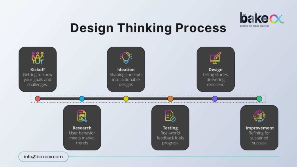
We strip away the noise and focus on where outcomes compound by using the Design Thinking Process:
- Journey Heatmaps → Spot friction-heavy screens.
- Task Success Analysis → Identify the 2–3 actions killing confidence.
- Behavioral Testing → Validate that tiny tweaks (like motion cues) cut hesitation by 28%+.
- Experience Redesign → Refine critical flows before scaling elsewhere.
Impact We’ve Delivered
BakeCX results come from targeting the critical 20% for working on their clients:
- Banking Apps → Simplified KYC/login cut drop-offs by 30–45%, accelerating activations
- Transactions → Adding trust cues reduced hesitation by 25–35%, boosting completions
- Enterprise Platforms → Cleaner menu hierarchies cut task time by 20–28%, lifting adoption
Why This Matters
These results weren’t achieved by redesigning every pixel. They came from targeting the right 20% better than anyone else.
Because at BakeCX, we have
- Delivered impact across 350+ projects.
- Partnered with clients in 45+ countries.
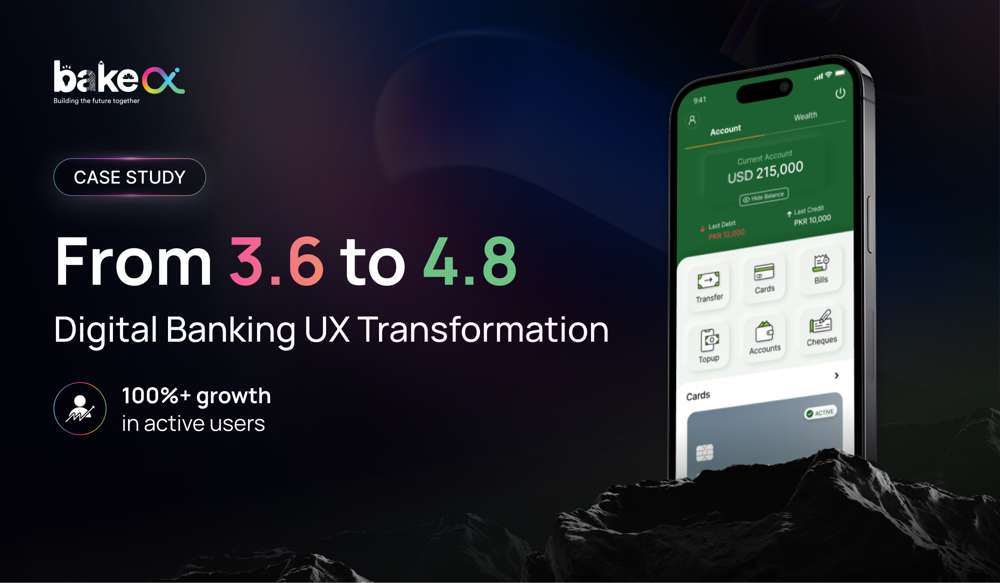
- Achieved 4.8 average app rating across millions of users
- Redesigned 100M+ digital interactions
Join the Conversation
- Subscribe for more UX strategies that scale
- Connect: info@bakecx.com | Contact page



Poor digital banking user experience silently damages customer trust. Here is where it starts and how to fix it.
Customer trust in banking is rarely lost because of a single incident. In most cases, it erodes gradually through everyday digital interactions that feel unclear, inconsistent, or unreliable. As digital banking platforms become the primary channel for customer engagement, digital banking user experience has become a direct determinant of trust.
Banks often assume trust is protected by strong security, compliance, and brand reputation. However, customers evaluate trust differently. For them, trust is shaped by how confi dently they can complete everyday tasks—checking balances, transferring money, paying bills, or reviewing transaction history—without hesitation or uncertainty.
This is why poor user experience directly impacts customer trust in banking, even when systems are technically sound.
UX Signals That Quietly Trigger Trust Loss
Trust erosion does not begin with major failures. It begins with subtle UX signals that customers may not consciously articulate but instinctively respond to.
Across digital banking platforms, the most common trust-weakening UX signals include:
● unclear success or failure states after transactions
● inconsistent interaction patterns across similar journeys
● delayed or missing system feedback during critical actions
● repeated authentication or verification loops
● transaction histories that lack clarity or context
In BakeCX’s work with financial institutions across mature and emerging markets, these signals consistently appear long before customers disengage. While each issue may seem minor in isolation, their repetition creates a perception of unreliability.
Transaction Uncertainty Has the Highest Trust Impact
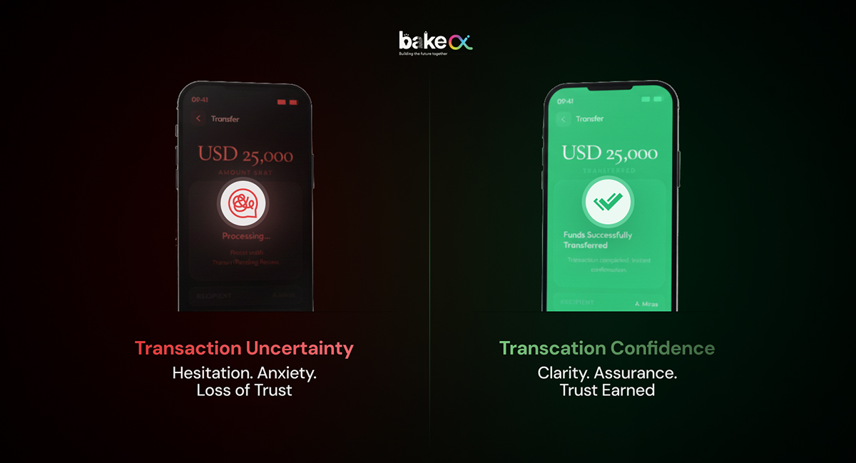
Among all UX failures, transaction uncertainty has the most immediate and measurable impact on trust in banking apps.
Customers can tolerate feature limitations, but they struggle with uncertainty when money is involved. When a transfer takes longer than expected without explanation, or when confirmation messages are unclear, customers experience anxiety at the moment they expect reassurance. In multiple BakeCX-led UX audits, transaction-related journeys were responsible for:
● Upto 40–55% of trust-related complaints
● A significant rise in repeat transaction attempts
● Increased reliance on call centers for confirmation
Importantly, these issues were rarely caused by transaction engines. They were caused by experience gaps—unclear states, poor feedback timing, and inconsistent confi rmation logic.
By addressing these gaps through clearer status indicators, predictable timing expectations, and improved error recovery fl ows, banks were able to reduce uncertainty without touching backend systems.
UX Failures and Complaint Volume Are Strongly Correlated
Banks often treat complaint volume as an operational issue. In reality, complaint volume is frequently an experience indicator. In projects reviewed by BakeCX, complaint spikes typically followed breakdowns at three UX points:
1. immediately after submitting a critical action
2. during authentication and verifi cation flows
3. when customers could not clearly interpret transaction history
When UX clarity was improved at these points, banks observed:
● 25–35% reduction in support queries related to digital channels
● Lower escalation rates for routine transactions
●Improved customer confi dence in self-service journeys
This reinforces a critical insight: customers contact support not because systems fail, but because experiences fail to explain outcomes clearly.
Experience Consistency Is a Leading Indicator of Trust Health
Trust in banking apps strengthens when experiences behave consistently. Experience consistency means:
● similar actions follow similar logic
● outcomes are communicated in familiar ways
● users don’t need to relearn flows across journeys
From a banking app usability perspective, inconsistency introduces cognitive effort and cognitive effort erodes trust.
BakeCX typically addresses experience consistency through:
● Journey standardization across high-frequency tasks
● Design system alignment for states, labels, and feedback
● Reduction of unnecessary steps in repeat actions
● Consistent confirmation, receipt, and reference patterns
When consistency improves, trust improves naturally. Customers complete tasks faster, rely less on support, and re-engage with digital features more confidently.
How Banks Cope With Trust Erosion Caused by Poor UX
When customer trust in banking begins to decline, the solution is rarely a full redesign or platform replacement. In most cases, trust can be stabilized by correcting experience mechanics at the journey level.
The approach BakeCX applies typically includes:
1. identifying trust-leak journeys (transfers, bill payments, beneficiary management, login, transaction history)
2. measuring task-level behavior such as drop-offs, retries, and time-to-completion
3. prioritizing transaction clarity and recovery paths
4. enforcing experience consistency across similar actions
5. validating changes through usability testing before broad rollout
This method allows banks to restore trust without disrupting existing systems, while improving both engagement and operational efficiency.
Is poor UX quietly weakening trust in your banking app?
If your digital platform is functional but customers still hesitate, the issue is often clarity, consistency, and transaction confidence—not features. A focused UX review can reveal where trust begins to erode and what to fix first.
Submit your requirements to info@bakecx.com. Our team responds within 1–2 working days.

Your mobile banking app did not break overnight. Find out where friction is quietly building and what to audit first.
Banks usually notice the symptoms first:
● Slight decline in digital adoption
● Increased support queries
● Friction in high-frequency journeys
● Customer hesitation in transaction flows
But the root cause is rarely the feature set. It is the absence of structured evaluation.
A mobile banking UX audit is not a redesign exercise. It is a diagnostic framework that identifies where friction accumulates, where confidence weakens, and where journey logic becomes inefficient.
This guide outlines how serious fintech teams evaluate their mobile banking experience systematically and measurably.
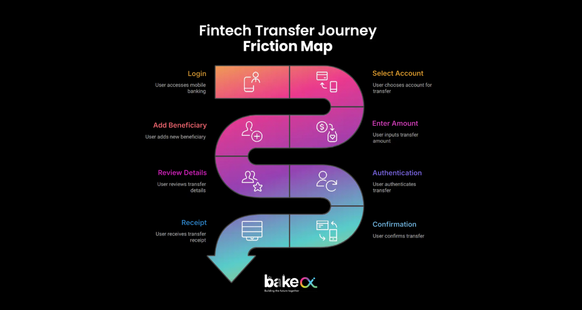
1. Start With High-Frequency Journeys, Not Screens
Most UX reviews focus on interface elements. Effective audits focus on journeys. In mobile banking, 70–80% of daily activity typically revolves around five actions:
● Login
● Balance check
● Fund transfer
● Bill payment
● Transaction history
The first step in a mobile banking audit is mapping these journeys step-by-step.
Questions evaluated include:
● How many steps are required to complete the task?
● Is progress clearly visible to the user?
● Are high-frequency actions accessible within two taps?
● Are redundant confirmations slowing the flow?
● Is navigation structured logically around user behavior?
The objective is simple: Measure how efficiently a customer can complete what they do most often.
2. Audit the Transaction Confidence Layer
In digital banking, usability matters. Confidence matters more.
Customers rarely complain about missing features. They complain when they are unsure whether money moved successfully.
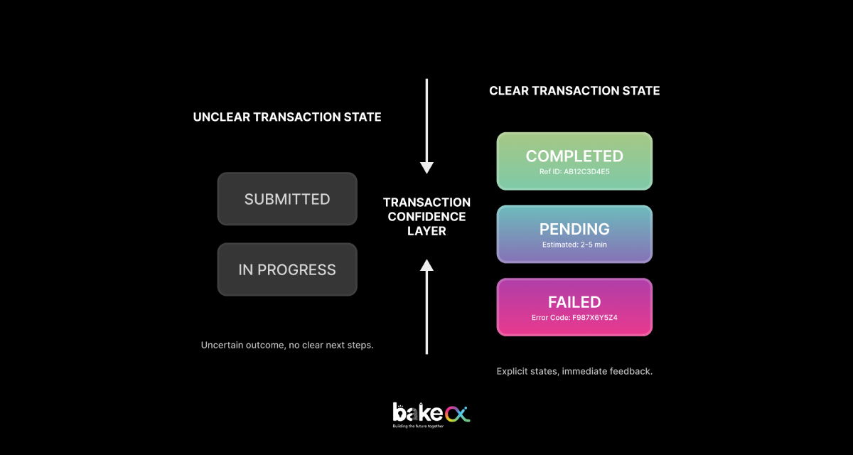
A structured UX audit evaluates the transaction confidence layer, including:
● Clear differentiation between Pending, Processing, and Completed states
● Transparent time expectations
● Visible and accessible reference numbers
● Structured and readable receipts
● Guided recovery if an error occurs
Across financial platforms reviewed by BakeCX, transaction uncertainty consistently appears as a primary trust-leak trigger, even when backend systems function correctly.
Improving clarity in transaction feedback alone often reduces repeat attempts, complaint escalation, and support dependency.
3. Evaluate Authentication and Session Behavior
Authentication flows are one of the most overlooked UX risk areas in banking apps. An audit evaluates:
● OTP expiry messaging clarity
● Retry logic predictability
● Biometric fallback behavior
● Session timeout warnings
● Data preservation during interruption
Inconsistent authentication logic creates cognitive friction and often results in abandonment during high-value tasks. A well-structured audit does not remove security layers. It evaluates whether those layers behave predictably.
4. Measure Experience Consistency Across Journeys
In regulated fintech environments, inconsistency is perceived as unreliability. During a UX audit, evaluators check:
● Button labeling consistency
● Confirmation state structure
● Terminology alignment
● CTA hierarchy
● Input field behavior
When similar actions follow different patterns across journeys, customers are forced to relearn interactions. That cognitive load accumulates. BakeCX addresses this through journey standardization frameworks rather than isolated UI changes.
5. Assess Cognitive Load and Step Compression
Mobile banking users expect speed. A structured UX audit evaluates:
● Number of visible options per screen
● Competing visual hierarchy
● Form chunking and grouping
● Decision overload
● Unnecessary alerts
High-performing banking apps typically compress high-frequency journeys without compromising compliance.
This is where step compression often produces measurable improvement in task completion time.
6. Connect UX to Operational Indicators
A mature UX audit connects design to operational metrics.
Evaluators analyze:
● Drop-off points in transaction flows
● Retry spikes
● Support ticket correlation
● Complaint clustering around digital journeys
Across fintech audits, improving clarity and consistency often results in:
● Reduced digital-channel support queries
● Faster task completion
● Higher repeat usage of core features
How BakeCX Executes a Mobile Banking UX Audit
BakeCX evaluates mobile banking platforms across four structured audit dimensions:
1. Journey Mapping: Tracing real user flows across high-frequency and transaction-critical tasks.
2. Friction Scoring: Scoring each journey across clarity, predictability, efficiency, recovery readiness, and consistency.
3. Confidence Risk Assessment: Identifying trust-leak triggers, transaction uncertainty points, and error recovery gaps.
4. Corrective Framework: Delivering actionable recommendations including:
● Step compression guidance
● Confirmation clarity restructuring
● Authentication simplification logic
● Journey standardization blueprint
This structured process ensures meaningful improvements without requiring full platform redesign.
When Should a Bank Conduct a UX Audit?
A mobile banking UX audit is typically necessary when:
● Digital adoption plateaus
● Complaints increase despite system stability
● Feature expansion makes navigation heavier
● Redesign efforts fail to improve engagement
A structured evaluation prevents incremental UX debt from accumulating.
Conclusion: Audit Before You Redesign
Most banks jump to redesign. Few pause to diagnose. A mobile banking UX audit provides clarity before change. It identifies where friction accumulates and where customer confidence weakens systematically.
If your mobile banking app feels functional but increasingly complex, the issue may not be capability. It may be accumulated friction. A structured UX audit reveals where to act first.
Submit Your Requirements
Our team responds within 1–2 working days.
Poor digital banking user experience silently damages customer trust. Here is where it starts and how to fix it.
Customer trust in banking is rarely lost because of a single incident. In most cases, it erodes gradually through everyday digital interactions that feel unclear, inconsistent, or unreliable. As digital banking platforms become the primary channel for customer engagement, digital banking user experience has become a direct determinant of trust.
Banks often assume trust is protected by strong security, compliance, and brand reputation. However, customers evaluate trust differently. For them, trust is shaped by how confi dently they can complete everyday tasks—checking balances, transferring money, paying bills, or reviewing transaction history—without hesitation or uncertainty.
This is why poor user experience directly impacts customer trust in banking, even when systems are technically sound.
UX Signals That Quietly Trigger Trust Loss
Trust erosion does not begin with major failures. It begins with subtle UX signals that customers may not consciously articulate but instinctively respond to.
Across digital banking platforms, the most common trust-weakening UX signals include:
● unclear success or failure states after transactions
● inconsistent interaction patterns across similar journeys
● delayed or missing system feedback during critical actions
● repeated authentication or verification loops
● transaction histories that lack clarity or context
In BakeCX’s work with financial institutions across mature and emerging markets, these signals consistently appear long before customers disengage. While each issue may seem minor in isolation, their repetition creates a perception of unreliability.
Transaction Uncertainty Has the Highest Trust Impact
Among all UX failures, transaction uncertainty has the most immediate and measurable impact on trust in banking apps.
Customers can tolerate feature limitations, but they struggle with uncertainty when money is involved. When a transfer takes longer than expected without explanation, or when confirmation messages are unclear, customers experience anxiety at the moment they expect reassurance. In multiple BakeCX-led UX audits, transaction-related journeys were responsible for:
● Upto 40–55% of trust-related complaints
● A significant rise in repeat transaction attempts
● Increased reliance on call centers for confirmation
Importantly, these issues were rarely caused by transaction engines. They were caused by experience gaps—unclear states, poor feedback timing, and inconsistent confi rmation logic.
By addressing these gaps through clearer status indicators, predictable timing expectations, and improved error recovery fl ows, banks were able to reduce uncertainty without touching backend systems.
UX Failures and Complaint Volume Are Strongly Correlated
Banks often treat complaint volume as an operational issue. In reality, complaint volume is frequently an experience indicator. In projects reviewed by BakeCX, complaint spikes typically followed breakdowns at three UX points:
1. immediately after submitting a critical action
2. during authentication and verifi cation flows
3. when customers could not clearly interpret transaction history
When UX clarity was improved at these points, banks observed:
● 25–35% reduction in support queries related to digital channels
● Lower escalation rates for routine transactions
●Improved customer confi dence in self-service journeys
This reinforces a critical insight: customers contact support not because systems fail, but because experiences fail to explain outcomes clearly.
Experience Consistency Is a Leading Indicator of Trust Health
Trust in banking apps strengthens when experiences behave consistently. Experience consistency means:
● similar actions follow similar logic
● outcomes are communicated in familiar ways
● users don’t need to relearn flows across journeys
From a banking app usability perspective, inconsistency introduces cognitive effort and cognitive effort erodes trust.
BakeCX typically addresses experience consistency through:
● Journey standardization across high-frequency tasks
● Design system alignment for states, labels, and feedback
● Reduction of unnecessary steps in repeat actions
● Consistent confirmation, receipt, and reference patterns
When consistency improves, trust improves naturally. Customers complete tasks faster, rely less on support, and re-engage with digital features more confidently.
How Banks Cope With Trust Erosion Caused by Poor UX
When customer trust in banking begins to decline, the solution is rarely a full redesign or platform replacement. In most cases, trust can be stabilized by correcting experience mechanics at the journey level.
The approach BakeCX applies typically includes:
1. identifying trust-leak journeys (transfers, bill payments, beneficiary management, login, transaction history)
2. measuring task-level behavior such as drop-offs, retries, and time-to-completion
3. prioritizing transaction clarity and recovery paths
4. enforcing experience consistency across similar actions
5. validating changes through usability testing before broad rollout
This method allows banks to restore trust without disrupting existing systems, while improving both engagement and operational efficiency.
Is poor UX quietly weakening trust in your banking app?
If your digital platform is functional but customers still hesitate, the issue is often clarity, consistency, and transaction confidence—not features. A focused UX review can reveal where trust begins to erode and what to fix first.
Submit your requirements to info@bakecx.com. Our team responds within 1–2 working days.
The Pareto Principle applied to UX design reveals that 20% of your digital experience flows drive 80% of user drop offs. Here is where to focus first.
The Pareto Principle, also known as the 80/20 Rule, isn’t a formal step of Design Thinking. But at BakeCX, we’ve embedded it as a strategic lens within our Design Thinking practice. Why? Because focusing on the wrong areas drains time, budget, and adoption potential. Focusing on the critical 20% multiplies impact that why the 80/20 Rule matters in UX
The Pareto Principle isn’t just a theory — it’s reality in digital experiences:
- 20% of UX flaws cause 80% of user drop-offs
- 20% of focus areas drive 80% of support tickets.
- 20% of missed expectations can trigger 80% of churn
Design Thinking aligns perfectly with this approach: it’s about identifying which 20% truly drives impact, and then channeling resources there.
The Cost of Ignoring it
Neglecting the critical 20% doesn’t just harm experience — it drains growth:
- Higher acquisition spend: Users leave if key UX issues aren’t fixed, forcing you to spend more to replace them.
- Slower adoption: Confusing flows make users hesitant, slowing product growth.
- Brand erosion: One bad experience can cost loyalty—88% of users won’t return after a single frustrating interaction (Toptal).
Companies that focus on critical user experience journeys see up to 400% higher ROI on design investment (Forrester).
Where to Look for the Critical 20%?
Over 25 years of design excellence and 350+ projects across banking, fintech, and SaaS, BakeCX has observed the same recurring UX gaps:
- Onboarding → Typically, 35–45% users drop when the first steps are unclear.
- Navigation → More than 36% struggle with poor information hierarchy.
- Transactions → Nearly 50-60% abandon when trust isn’t reinforced at confirmation.
These few flows determine retention more than the other 50 screens combined.
How BakeCX Applies the 80/20 Lens
We strip away the noise and focus on where outcomes compound by using the Design Thinking Process:
- Journey Heatmaps → Spot friction-heavy screens.
- Task Success Analysis → Identify the 2–3 actions killing confidence.
- Behavioral Testing → Validate that tiny tweaks (like motion cues) cut hesitation by 28%+.
- Experience Redesign → Refine critical flows before scaling elsewhere.
Impact We’ve Delivered
BakeCX results come from targeting the critical 20% for working on their clients:
- Banking Apps → Simplified KYC/login cut drop-offs by 30–45%, accelerating activations
- Transactions → Adding trust cues reduced hesitation by 25–35%, boosting completions
- Enterprise Platforms → Cleaner menu hierarchies cut task time by 20–28%, lifting adoption
Why This Matters
These results weren’t achieved by redesigning every pixel. They came from targeting the right 20% better than anyone else.
Because at BakeCX, we have
- Delivered impact across 350+ projects.
- Partnered with clients in 45+ countries.
- Achieved 4.8 average app rating across millions of users
- Redesigned 100M+ digital interactions
Join the Conversation
- Subscribe for more UX strategies that scale
- Connect: info@bakecx.com | Contact page