


Your mobile banking app did not break overnight. Find out where friction is quietly building and what to audit first.
Banks usually notice the symptoms first:
● Slight decline in digital adoption
● Increased support queries
● Friction in high-frequency journeys
● Customer hesitation in transaction flows
But the root cause is rarely the feature set. It is the absence of structured evaluation.
A mobile banking UX audit is not a redesign exercise. It is a diagnostic framework that identifies where friction accumulates, where confidence weakens, and where journey logic becomes inefficient.
This guide outlines how serious fintech teams evaluate their mobile banking experience systematically and measurably.
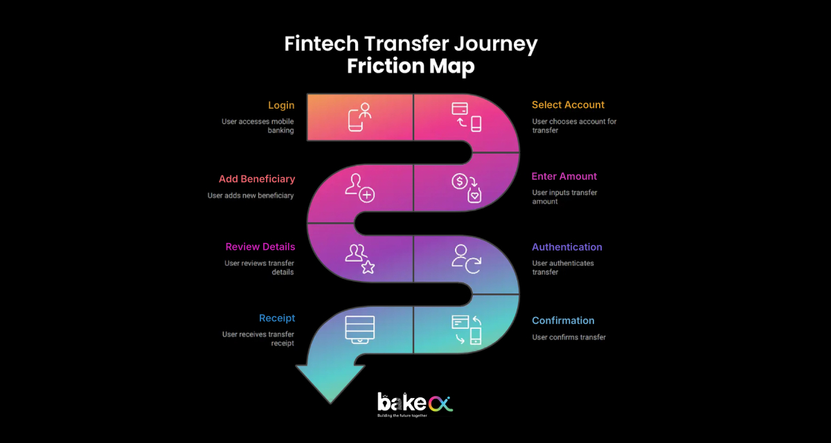
1. Start With High-Frequency Journeys, Not Screens
Most UX reviews focus on interface elements. Effective audits focus on journeys. In mobile banking, 70–80% of daily activity typically revolves around five actions:
● Login
● Balance check
● Fund transfer
● Bill payment
● Transaction history
The first step in a mobile banking audit is mapping these journeys step-by-step.
Questions evaluated include:
● How many steps are required to complete the task?
● Is progress clearly visible to the user?
● Are high-frequency actions accessible within two taps?
● Are redundant confirmations slowing the flow?
● Is navigation structured logically around user behavior?
The objective is simple: Measure how efficiently a customer can complete what they do most often.
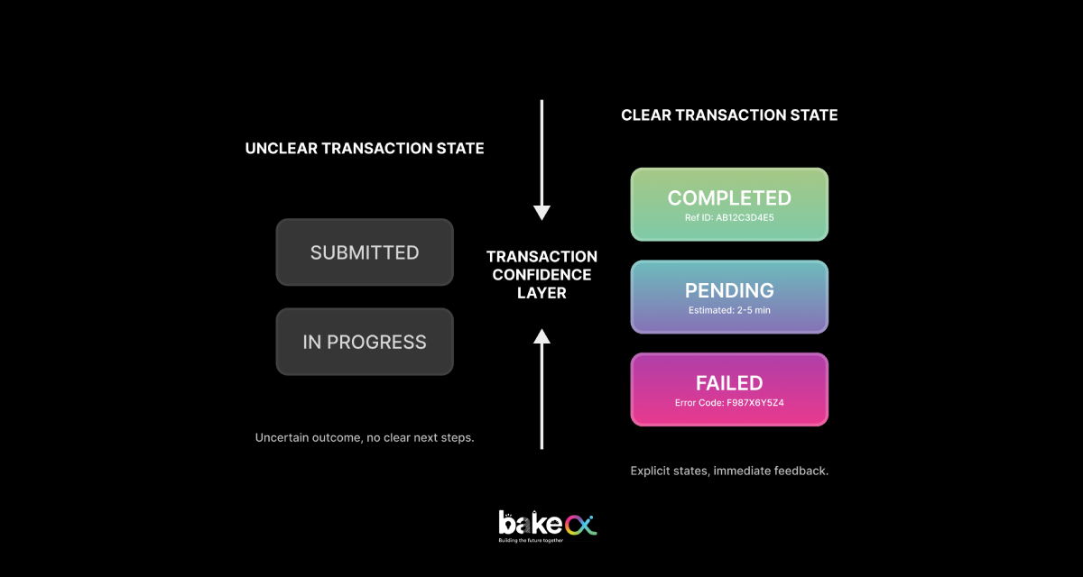
2. Audit the Transaction Confidence Layer
In digital banking, usability matters. Confidence matters more.
Customers rarely complain about missing features. They complain when they are unsure whether money moved successfully.
A structured UX audit evaluates the transaction confidence layer, including:
● Clear differentiation between Pending, Processing, and Completed states
● Transparent time expectations
● Visible and accessible reference numbers
● Structured and readable receipts
● Guided recovery if an error occurs
Across financial platforms reviewed by BakeCX, transaction uncertainty consistently appears as a primary trust-leak trigger, even when backend systems function correctly.
Improving clarity in transaction feedback alone often reduces repeat attempts, complaint escalation, and support dependency.
3. Evaluate Authentication and Session Behavior
Authentication flows are one of the most overlooked UX risk areas in banking apps. An audit evaluates:
● OTP expiry messaging clarity
● Retry logic predictability
● Biometric fallback behavior
● Session timeout warnings
● Data preservation during interruption
Inconsistent authentication logic creates cognitive friction and often results in abandonment during high-value tasks. A well-structured audit does not remove security layers. It evaluates whether those layers behave predictably.
4. Measure Experience Consistency Across Journeys
In regulated fintech environments, inconsistency is perceived as unreliability. During a UX audit, evaluators check:
● Button labeling consistency
● Confirmation state structure
● Terminology alignment
● CTA hierarchy
● Input field behavior
When similar actions follow different patterns across journeys, customers are forced to relearn interactions. That cognitive load accumulates. BakeCX addresses this through journey standardization frameworks rather than isolated UI changes.
5. Assess Cognitive Load and Step Compression
Mobile banking users expect speed. A structured UX audit evaluates:
● Number of visible options per screen
● Competing visual hierarchy
● Form chunking and grouping
● Decision overload
● Unnecessary alerts
High-performing banking apps typically compress high-frequency journeys without compromising compliance.
This is where step compression often produces measurable improvement in task completion time.
6. Connect UX to Operational Indicators
A mature UX audit connects design to operational metrics.
Evaluators analyze:
● Drop-off points in transaction flows
● Retry spikes
● Support ticket correlation
● Complaint clustering around digital journeys
Across fintech audits, improving clarity and consistency often results in:
● Reduced digital-channel support queries
● Faster task completion
● Higher repeat usage of core features
How BakeCX Executes a Mobile Banking UX Audit
BakeCX evaluates mobile banking platforms across four structured audit dimensions:
1. Journey Mapping: Tracing real user flows across high-frequency and transaction-critical tasks.
2. Friction Scoring: Scoring each journey across clarity, predictability, efficiency, recovery readiness, and consistency.
3. Confidence Risk Assessment: Identifying trust-leak triggers, transaction uncertainty points, and error recovery gaps.
4. Corrective Framework: Delivering actionable recommendations including:
● Step compression guidance
● Confirmation clarity restructuring
● Authentication simplification logic
● Journey standardization blueprint
This structured process ensures meaningful improvements without requiring full platform redesign.
When Should a Bank Conduct a UX Audit?
A mobile banking UX audit is typically necessary when:
● Digital adoption plateaus
● Complaints increase despite system stability
● Feature expansion makes navigation heavier
● Redesign efforts fail to improve engagement
A structured evaluation prevents incremental UX debt from accumulating.
Conclusion: Audit Before You Redesign
Most banks jump to redesign. Few pause to diagnose. A mobile banking UX audit provides clarity before change. It identifies where friction accumulates and where customer confidence weakens systematically.
If your mobile banking app feels functional but increasingly complex, the issue may not be capability. It may be accumulated friction. A structured UX audit reveals where to act first.
Submit Your Requirements
Our team responds within 1–2 working days.