


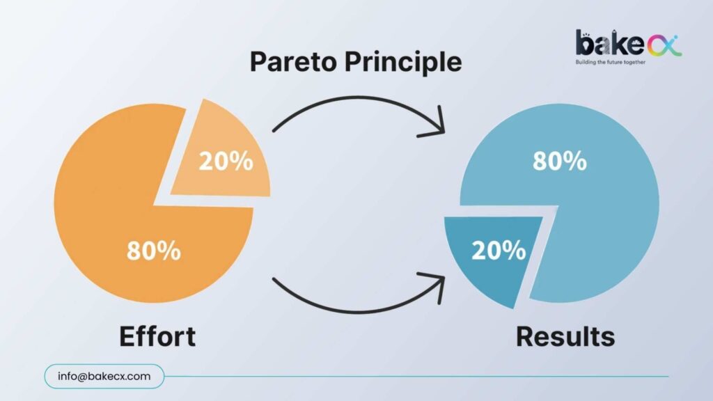
The Pareto Principle applied to UX design reveals that 20% of your digital experience flows drive 80% of user drop offs. Here is where to focus first.
The Pareto Principle, also known as the 80/20 Rule, isn’t a formal step of Design Thinking. But at BakeCX, we’ve embedded it as a strategic lens within our Design Thinking practice. Why? Because focusing on the wrong areas drains time, budget, and adoption potential. Focusing on the critical 20% multiplies impact that why the 80/20 Rule matters in UX
The Pareto Principle isn’t just a theory — it’s reality in digital experiences:
- 20% of UX flaws cause 80% of user drop-offs
- 20% of focus areas drive 80% of support tickets.
- 20% of missed expectations can trigger 80% of churn
Design Thinking aligns perfectly with this approach: it’s about identifying which 20% truly drives impact, and then channeling resources there.
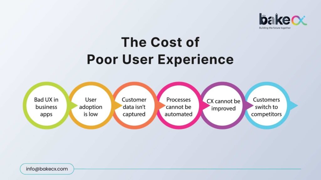
The Cost of Ignoring it
Neglecting the critical 20% doesn’t just harm experience — it drains growth:
- Higher acquisition spend: Users leave if key UX issues aren’t fixed, forcing you to spend more to replace them.
- Slower adoption: Confusing flows make users hesitant, slowing product growth.
- Brand erosion: One bad experience can cost loyalty—88% of users won’t return after a single frustrating interaction (Toptal).
Companies that focus on critical user experience journeys see up to 400% higher ROI on design investment (Forrester).
Where to Look for the Critical 20%?
Over 25 years of design excellence and 350+ projects across banking, fintech, and SaaS, BakeCX has observed the same recurring UX gaps:
- Onboarding → Typically, 35–45% users drop when the first steps are unclear.
- Navigation → More than 36% struggle with poor information hierarchy.
- Transactions → Nearly 50-60% abandon when trust isn’t reinforced at confirmation.
These few flows determine retention more than the other 50 screens combined.
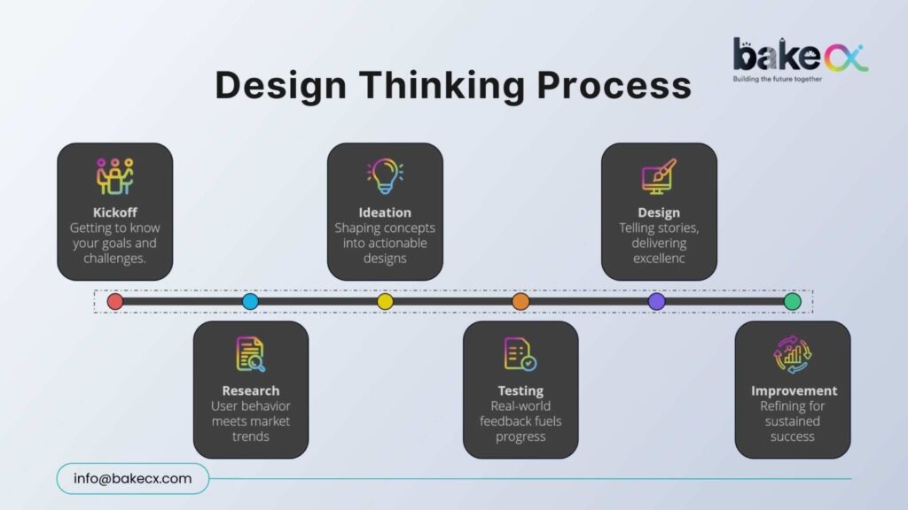
How BakeCX Applies the 80/20 Lens
We strip away the noise and focus on where outcomes compound by using the Design Thinking Process:
- Journey Heatmaps → Spot friction-heavy screens.
- Task Success Analysis → Identify the 2–3 actions killing confidence.
- Behavioral Testing → Validate that tiny tweaks (like motion cues) cut hesitation by 28%+.
- Experience Redesign → Refine critical flows before scaling elsewhere.
Impact We’ve Delivered
BakeCX results come from targeting the critical 20% for working on their clients:
- Banking Apps → Simplified KYC/login cut drop-offs by 30–45%, accelerating activations
- Transactions → Adding trust cues reduced hesitation by 25–35%, boosting completions
- Enterprise Platforms → Cleaner menu hierarchies cut task time by 20–28%, lifting adoption
Why This Matters
These results weren’t achieved by redesigning every pixel. They came from targeting the right 20% better than anyone else.
Because at BakeCX, we have
- Delivered impact across 350+ projects.
- Partnered with clients in 45+ countries.
- Achieved 4.8 average app rating across millions of users
- Redesigned 100M+ digital interactions
Join the Conversation
- Subscribe for more UX strategies that scale
- Connect: info@bakecx.com | Contact page